Good Books also have paperbacks of the rest of the series if you want to drop by the store!
Good Books do ship internationally, although be forewarned about shipping costs from NZ! There will also be paperbacks available on all the usual online retailers when the book launches, though these won’t be signed.
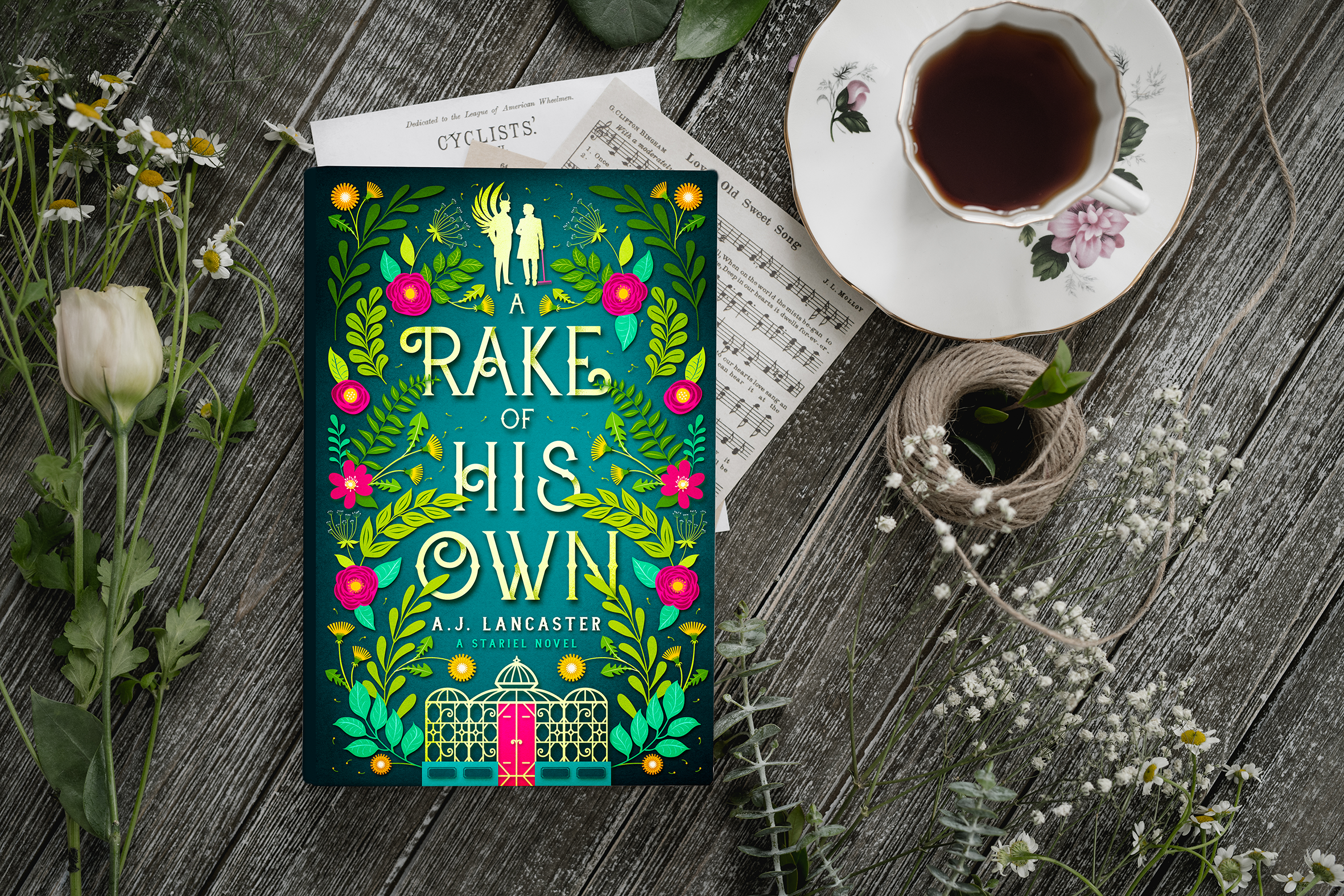
Will there be an audiobook of A Rake of His Own?
I’ve had quite a few people ask this question – and the answer is yes! There will be an audiobook edition of A Rake of His Own. However, that’s all I know at present. I’m currently in talks with Podium (who produced the audiobooks of the first four books) and I’ll let you know as soon as I have more information about when this will be available.
This month I have been typesetting up a storm to get paperback copies of The Lord of Stariel ready for release in November.
Typesetting is the process of formatting a book, so called because back in the day it involved physically setting type. I’ve done this the old-fashioned way exactly once in my life, as part of a training course, and whilst fun it definitely isn’t something you’d want to do for an entire book (it took me about 20 minutes to set my one allocated line of type!).
Many teeny blocks of lead
Nowadays, typesetting means electronically laying out a book for print (and laying out the e-book, but that’s a whole ‘nother kettle of fish). I happen to really, really love print typesetting, because I am exactly the kind of person who will agonise over an extra half-millimetre of margin and spend hours weighing up the pros and cons of different fonts.
If you are not this kind of person, there are some automated solutions. I use one of these (a program called Vellum) for formatting e-books. To my mind, there’s no point agonising over e-book formatting because the appearance of an e-book changes across platforms anyway. You have to let go of the illusion of control.
You know what you can control to your heart’s content, though? Print books! For typesetting print books, I use Adobe InDesign, which is a control freak’s dream. This is both a great and terrible power. On the bright side, there will be no auto-formatting doing things you didn’t tell it to do (I’m looking at you, Microsoft Word), but on the down side, there will be no auto-formatting to save you. All faults will be entirely your own.
Truth.
You can’t truly judge your typesetting until you see a physical proof copy, but printing out pages and cutting them to the correct page size is a useful proxy. Hence my living room has been looking like a bookish murder scene recently, full of disembodied pages:
Many iterations of pages with slightly different margins, leading, or font sizes. May appear identical to the untrained or less obsessive eye.
Once you’ve typeset your book, you then know how many pages it will be – which means you can work out the spine width! And from the spine width comes the BEAUTIFUL FULL COVER SPREAD thanks to my designer:
What the paperback version of my book will look like when ironed (DO NOT IRON BOOKS!)
The last thing to decide on for a print book is the cover finish. As an indie publisher, I have two choices: matte or gloss finish (other cool combo options like metallic foiling and spot gloss etc aren’t available with the print-on-demand (POD) providers I’m using. I’ll do a separate blog about that, but basically POD means someone can order 1 copy of my book from a retailer and behind the scenes the printer will print and ship 1 copy directly to the customer.)
It’s quite hard to show the difference in a photograph, but gloss finish is, er, glossy, and makes colours seem richer. Matte is, er, not glossy, and it feels smoother in the hand but can ‘flatten’ darker colours.
Proof copies! BE STILL MY BEATING HEART. Matte finish is on the left; gloss finish on the right. (You can’t tell from this photo at all, but they actually do look extremely different in real life.)
Next step: Checking the proof copies! (It would be impossible to overstate how overwhelmingly excited I am to be able to hold ACTUAL PHYSICAL COPIES OF MY BOOK.)
This is a question I first asked the internet at around age 14, after finishing my then-masterwork of epic fantasy (spoiler: not actually a masterwork of epic fantasy).
The internet answered: Um. It’s complicated.
Now, keep in mind that the internet then was not the internet of now, when indie publishing has made this question (a) a lot more commonly asked and (b) a lot more commonly answered. Note that I didn’t say I googled the question, because I’m not sure I was actually using Google back then. (My introduction to Google came from one of my classmates at around this same age:
“Hey, there’s this really great search engine you should check out called Google.com”
Me: “How do you spell that?”)
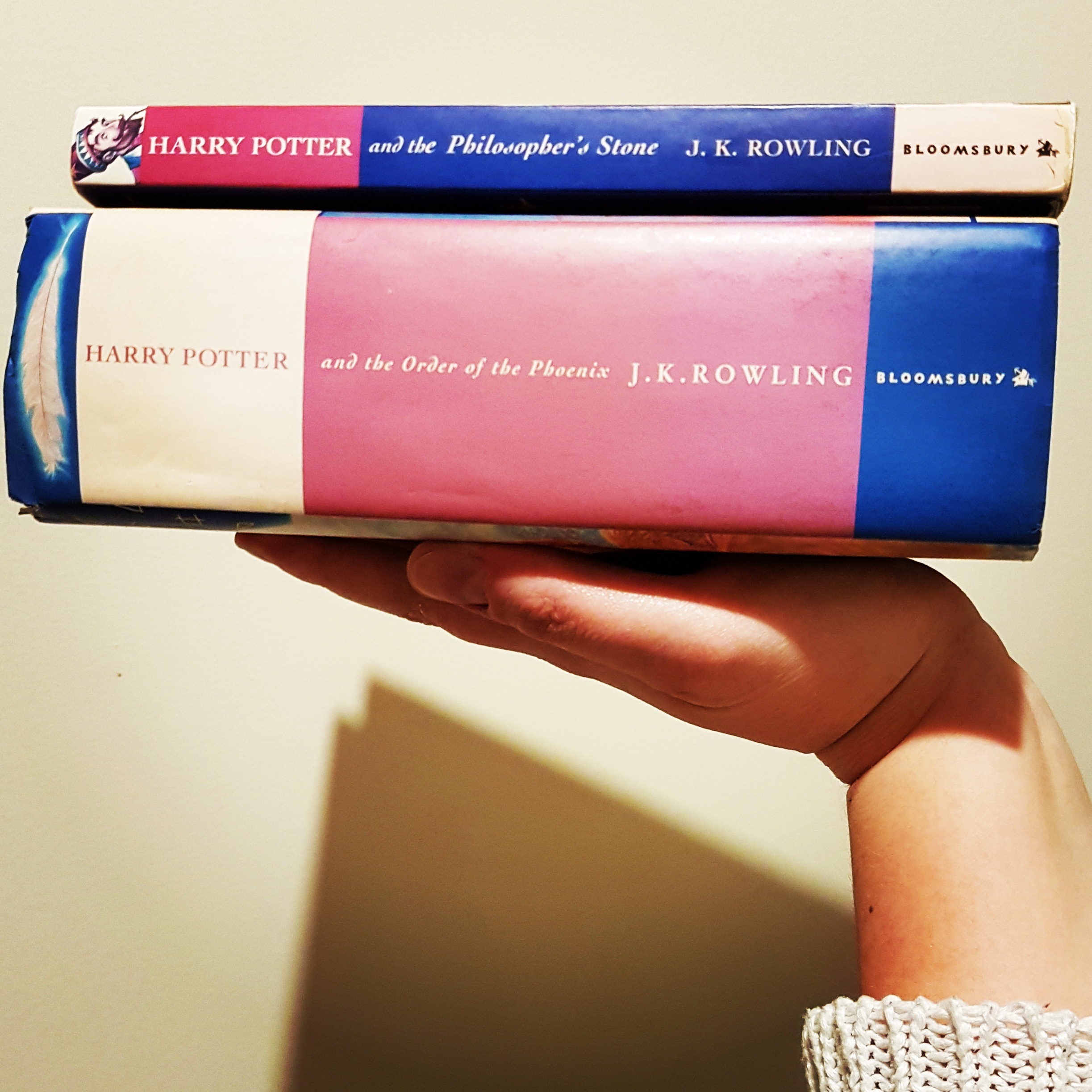
So today, if you ask the internet how long a book is, it will tell you: Um. It’s complicated. That’s because there isn’t actually a standard length for books. Exhibit A:
Harry Potter and the Philosopher’s Stone (77,325) and Harry Potter and the Order of the Phoenix (257,154).
In terms of novels – adult novels – around 40,000 words is where the starting point gets drawn. The 70,000-100,000 word range is standard for most genres except epic fantasy, which tends to be 100,000 words minimum, and some subgenres of romance that tend to run shorter.
I looked up wordcounts of a random assortment of books I like, and you can see how much they vary.
Book
Wordcount
Harry Potter and the Philosopher’s Stone by J.K. Rowling
77,325
Faro’s Daughter by Georgette Heyer
88,743
Storm Front by Jim Butcher
86,961
Mort by Terry Pratchett
94,240
The Hobbit by J.R.R Tolkien
95,022
Pride and Prejudice by Jane Austen
120, 697
Uprooted by Naomi Novik
143,840
Twilight by Stephenie Meyer
168,640
A Game of Thrones by George R. Martin
298,000
The Way of Kings by Brandon Sanderson*
387,000
Does word count matter? For print books, yes. The longer the book, the more it costs to print. There’s only so big you can physically make a paperback before it ceases to function as a book and becomes merely a blunt instrument. Hardbacks are more robust and can contain more words before they break under the strain, but they’re also more expensive to print than paperbacks. This is why the world has given us Brandon Sanderson’s The Way of Kings in two volumes. See also: George R. Martin (did I mention the 100k general starting point for epic fantasy?)
Does word count matter for ebooks? A smidgeon** maybe, but mostly no.
How long are my books? Well, they’re not yet finished so this is a preliminary wordcount:
The Lord of Stariel: 82k The Prince of Secrets: 96k The Court of Mortals: 110k Book 4 Currently Nameless: 0, since I haven’t started writing yet. But otherwise, there seems to be a trend here…
*pretty sure Brandon Sanderson is an alien / robot / magic and as such is an outlier that should not be counted.
**From a dollar perspective, Amazon charges to deliver ebook files based on their size. Amazon.com charges US $0.15/MB, but since file size is way more affected by the number of images than the number of words, it’s not really an issue of ebook length per se.
This weekend I’m trying to choose the optimum book size. Specifically, fantasy novel size. This isn’t an abstract decision—what I pick will be the size I ask my designer to do for my covers. This is going to be a dorky technical post consisting of me working through my logic on the subject, so forgive me. More scintillating posts to follow, I promise.
Obviously, e-book covers don’t have a size so much as a ratio of width: height. I don’t think anyone particularly notices or cares whether the ratio is 1:1.6 or 1:1.5 or 1:1.45 so long as it’s, y’know, a rectangly bookish ratio and not a square.
A selection of sort-of-the-same-genre-as-mine ebook covers. Difference in width:height ratio = no one notices or cares!
So this is a decision where I think print preferences can rule and dictate the corresponding ebook cover size.
There are two big print-on-demand outfits for indies: Createspace and IngramSpark. The print-on-demand bit is important, because it means I don’t have to pay for warehousing or minimum print run costs; these guys print-and-ship individual copies as they are ordered and charge me on a per-copy basis. IngramSpark offers more formats and wider distribution options, but Createspace is cheaper and easier to set up. Long-term, I think I may use both, but to start with I intend to go through Createspace.
Because I’m not a heathen, my novels will be printed on cream paper rather than white. Createspace offers expanded distribution, but only for some formats (especially in cream paper). Expanded distribution means they will distribute a book to places other than Amazon.com. Given the constraints (cream paper, expanded distribution, available on both Createspace and IngramSpark), my choices become instantly quite limited:
5” x 8” (127 x 203 mm)
5.25” x 8” (133 x 203 mm)
5.5” x 8.5” (139.7 x 215.9 mm)
6” x 9” (152 x 228.6 mm)
All of these sizes are…odd, from a New Zealand reader’s perspective. They’re just slightly off the common sizes we get here, which are the same as the UK:
A format “mass market paperbacks” (110mm x 178mm)
B format (129mm x 198mm)
C format “trade paperbacks” (135mm x 216mm)
A, B, and C format books from my shelf.
Presumably the odd USA sizes are actually common book sizes over there and not just randomly made up to be difficult, but I’m struggling to find any examples in my bookshelf in any of the standard Createspace formats. However, they’re not that different from A, B, and C format books, so I’m using those as a basis.
Step 1. Immediately remove 6” x 9” as a choice because that just seems unnecessarily enormous. I’m not writing Game of Thrones; I don’t need all the extra page space I can get. Also I don’t even own any books that big.
I think 5.5” x 8.5” (139.7 x 215.9 mm) is my best option. It’s a decent size without feeling monstrous, and it’s almost trade paperback size (135mm x 216mm) but about half a centimetre wider. It also has a width:height ratio that’s comfortably in the middle of the examples I put above ( 1:1.55). I think I can live with this.
OK, decision made. Almost-but-not-quite C format paperbacks, here we come!