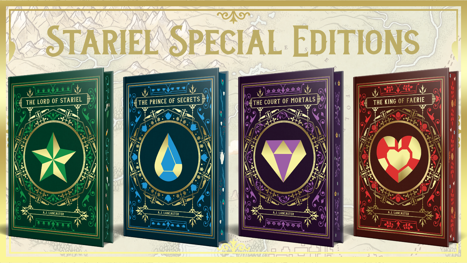
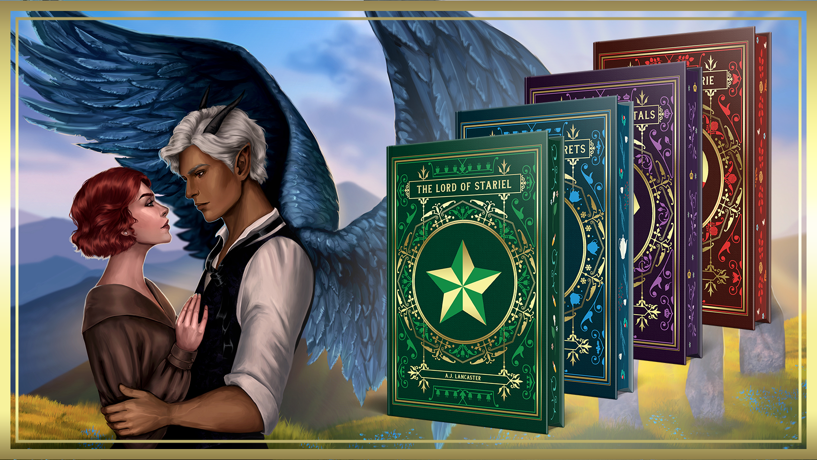
Before I had a chance to make a post here about the Stariel Kickstarter being live, the campaign fully! funded. Which means, these deluxe special editions are going to happen! And boy are they deluxe. We’re talking foiled faux-leather cases, reversible dustjackets, interior art, and endpaper maps!
The campaign is here if you want to snag your copy or just lurk and check out the art:
I know not everyone is familiar with Kickstarter, so I’ve put together this 101 explainer for those of you wondering what this is all about! If you’re already a savvy Kickstarter connoisseur, you can go straight to my campaign here:
I’ve wanted to offer Stariel special editions for a long time, but the printing technology required to bring fancy hardbacks to life means I ideally need to order a whole lot of books at once. Which means a big upfront cost to pay for a print run.
Enter Kickstarter! Kickstarter is a crowdfunding platform for creative projects that allows fans to ‘pledge’ for different ‘rewards’ – essentially you pre-order your shiny books upfront to help reach my campaign’s funding goal. This means I’ll not only be able to pay for the print run but also I’ll know how many books to order.
What are rewards?
‘Rewards’ are what Kickstarter calls the products I’m offering to people who back my campaign. In this case, the main rewards you can choose are Stariel hardbacks (just one book or the whole set). There is also a digital reward option available for those of you with limited shelf space who still want to support my Kickstarter.
How do I pick the reward I want?
You can find the rewards in their own tab if you scroll to the top of the campaign.
They also show as a sidebar if you’re on a desktop. Scroll through the list to find the reward you want and click the pledge $XX button. You’ll be given the choice to add on additional items if, for example, you want extra copies of books or to add a bookmark. Shipping will be automatically calculated once you select the country you’re shipping to – if your country isn’t listed, contact support@merrick-books.com and they will add it for you.
What are add-ons?
After you choose your pledge level, you will get the option to add ‘add-ons’. This is where you can add extra copies or swag items, but if you’re happy with what’s in the pledge you selected, you don’t need to add anything on.
Shipping to my country isn’t showing up?
Shipping is listed for most locations, but because there are thousands of combinations, your country might not be listed! If your location isn’t showing up, please reach out to Merrick Books, who are managing shipping for me, and they will update the list of countries to include yours. You can reach them here: support@merrick-books.com.
When does the campaign start/end?
The campaign runs for just over three weeks, starting 16 September (17 September in New Zealand) and ending on 9 October (10 October in New Zealand).
What happens if the campaign doesn’t reach its funding goal?
Then nothing! If we don’t make the funding goal by the end of the campaign, no one who pledged towards it will be charged, and I will return to the drawing board.
What are stretch goals?
If the campaign goes super well and we fund much higher than expected, I’ll be able to add more bells and whistles to the shiny editions (like more interior illustrations).
Is A Rake of His Own included?
No, the Stariel spinoff / book 5 A Rake of His Own is NOT part of this kickstarter. This is for two reasons:
Doing four books in one campaign is already pushing things, both in terms of behind-the-scenes organisation and in terms of affordability for you guys. Fancy editions aren’t cheap!
If I run a separate campaign for A Rake of His Own after this one, I can fully focus on it as the star of the show. It’s such a special book to me, and I felt like including it with the main Stariel quartet would mean it would inevitably be overshadowed.
So we WILL be getting a shiny edition of Rake too, but it WON’T be until later.
Any other questions? Let me know in the comments and I’ll do my best to answer them!
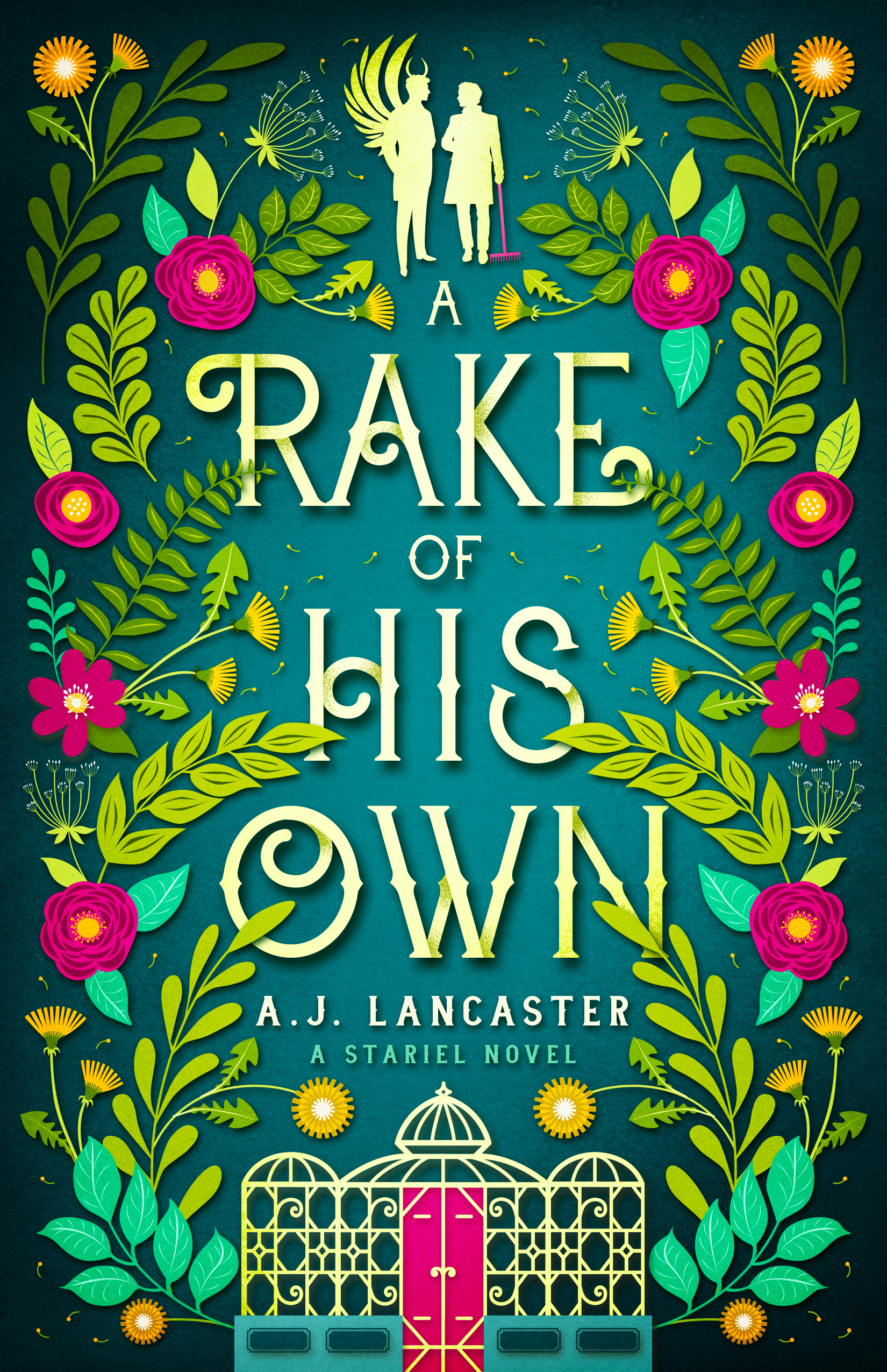
What’s that? A cover reveal for A Rake of His Own!
LOOK HOW BEAUTIFUL IT IS!!! Once again design by the phenomenal Jenny Zemanek. Jenny and I talked a lot about how to make this cover look related to the quartet but also clearly its own thing. The other covers all have a set of wings at the top, so for this one I thought it would be fun to replace that with a silhouette of my two leads. My fae prince obviously needed wings and horns, so Jenny sent me about 50 different horn vectors to choose from. It was surprisingly hard to pick a favourite!
Large chunks of the book are set in and around the greenhouses of the university, so that was where the Victorian greenhouse and plant motif came from. The dandelions also feature in an important fae spell we get to see in this book.
A Rake of His Own is a wild, tropey ride, and I feel like the vivid colours really reflect that. Which brings us to… the rake. The pun was too good to resist!
A Rake of His Own will release 28 October 2022 and you can pre-order it now!
Thanks so much to all the bookstagrammers who helped with this reveal. Check out their pics; they’re gorgeous!
To celebrate, I am also giving away a paperback copy of The Lord of Stariel. Head on over to this post on Instagram to enter: https://www.instagram.com/p/ChMwCm9LGAe/
This month I have been typesetting up a storm to get paperback copies of The Lord of Stariel ready for release in November.
Typesetting is the process of formatting a book, so called because back in the day it involved physically setting type. I’ve done this the old-fashioned way exactly once in my life, as part of a training course, and whilst fun it definitely isn’t something you’d want to do for an entire book (it took me about 20 minutes to set my one allocated line of type!).
Many teeny blocks of lead
Nowadays, typesetting means electronically laying out a book for print (and laying out the e-book, but that’s a whole ‘nother kettle of fish). I happen to really, really love print typesetting, because I am exactly the kind of person who will agonise over an extra half-millimetre of margin and spend hours weighing up the pros and cons of different fonts.
If you are not this kind of person, there are some automated solutions. I use one of these (a program called Vellum) for formatting e-books. To my mind, there’s no point agonising over e-book formatting because the appearance of an e-book changes across platforms anyway. You have to let go of the illusion of control.
You know what you can control to your heart’s content, though? Print books! For typesetting print books, I use Adobe InDesign, which is a control freak’s dream. This is both a great and terrible power. On the bright side, there will be no auto-formatting doing things you didn’t tell it to do (I’m looking at you, Microsoft Word), but on the down side, there will be no auto-formatting to save you. All faults will be entirely your own.
Truth.
You can’t truly judge your typesetting until you see a physical proof copy, but printing out pages and cutting them to the correct page size is a useful proxy. Hence my living room has been looking like a bookish murder scene recently, full of disembodied pages:
Many iterations of pages with slightly different margins, leading, or font sizes. May appear identical to the untrained or less obsessive eye.
Once you’ve typeset your book, you then know how many pages it will be – which means you can work out the spine width! And from the spine width comes the BEAUTIFUL FULL COVER SPREAD thanks to my designer:
What the paperback version of my book will look like when ironed (DO NOT IRON BOOKS!)
The last thing to decide on for a print book is the cover finish. As an indie publisher, I have two choices: matte or gloss finish (other cool combo options like metallic foiling and spot gloss etc aren’t available with the print-on-demand (POD) providers I’m using. I’ll do a separate blog about that, but basically POD means someone can order 1 copy of my book from a retailer and behind the scenes the printer will print and ship 1 copy directly to the customer.)
It’s quite hard to show the difference in a photograph, but gloss finish is, er, glossy, and makes colours seem richer. Matte is, er, not glossy, and it feels smoother in the hand but can ‘flatten’ darker colours.
Proof copies! BE STILL MY BEATING HEART. Matte finish is on the left; gloss finish on the right. (You can’t tell from this photo at all, but they actually do look extremely different in real life.)
Next step: Checking the proof copies! (It would be impossible to overstate how overwhelmingly excited I am to be able to hold ACTUAL PHYSICAL COPIES OF MY BOOK.)
This weekend I’m trying to choose the optimum book size. Specifically, fantasy novel size. This isn’t an abstract decision—what I pick will be the size I ask my designer to do for my covers. This is going to be a dorky technical post consisting of me working through my logic on the subject, so forgive me. More scintillating posts to follow, I promise.
Obviously, e-book covers don’t have a size so much as a ratio of width: height. I don’t think anyone particularly notices or cares whether the ratio is 1:1.6 or 1:1.5 or 1:1.45 so long as it’s, y’know, a rectangly bookish ratio and not a square.
A selection of sort-of-the-same-genre-as-mine ebook covers. Difference in width:height ratio = no one notices or cares!
So this is a decision where I think print preferences can rule and dictate the corresponding ebook cover size.
There are two big print-on-demand outfits for indies: Createspace and IngramSpark. The print-on-demand bit is important, because it means I don’t have to pay for warehousing or minimum print run costs; these guys print-and-ship individual copies as they are ordered and charge me on a per-copy basis. IngramSpark offers more formats and wider distribution options, but Createspace is cheaper and easier to set up. Long-term, I think I may use both, but to start with I intend to go through Createspace.
Because I’m not a heathen, my novels will be printed on cream paper rather than white. Createspace offers expanded distribution, but only for some formats (especially in cream paper). Expanded distribution means they will distribute a book to places other than Amazon.com. Given the constraints (cream paper, expanded distribution, available on both Createspace and IngramSpark), my choices become instantly quite limited:
5” x 8” (127 x 203 mm)
5.25” x 8” (133 x 203 mm)
5.5” x 8.5” (139.7 x 215.9 mm)
6” x 9” (152 x 228.6 mm)
All of these sizes are…odd, from a New Zealand reader’s perspective. They’re just slightly off the common sizes we get here, which are the same as the UK:
A format “mass market paperbacks” (110mm x 178mm)
B format (129mm x 198mm)
C format “trade paperbacks” (135mm x 216mm)
A, B, and C format books from my shelf.
Presumably the odd USA sizes are actually common book sizes over there and not just randomly made up to be difficult, but I’m struggling to find any examples in my bookshelf in any of the standard Createspace formats. However, they’re not that different from A, B, and C format books, so I’m using those as a basis.
Step 1. Immediately remove 6” x 9” as a choice because that just seems unnecessarily enormous. I’m not writing Game of Thrones; I don’t need all the extra page space I can get. Also I don’t even own any books that big.
I think 5.5” x 8.5” (139.7 x 215.9 mm) is my best option. It’s a decent size without feeling monstrous, and it’s almost trade paperback size (135mm x 216mm) but about half a centimetre wider. It also has a width:height ratio that’s comfortably in the middle of the examples I put above ( 1:1.55). I think I can live with this.
OK, decision made. Almost-but-not-quite C format paperbacks, here we come!