

This month I have been typesetting up a storm to get paperback copies of The Lord of Stariel ready for release in November.
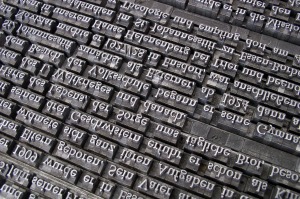
Typesetting is the process of formatting a book, so called because back in the day it involved physically setting type. I’ve done this the old-fashioned way exactly once in my life, as part of a training course, and whilst fun it definitely isn’t something you’d want to do for an entire book (it took me about 20 minutes to set my one allocated line of type!).
Nowadays, typesetting means electronically laying out a book for print (and laying out the e-book, but that’s a whole ‘nother kettle of fish). I happen to really, really love print typesetting, because I am exactly the kind of person who will agonise over an extra half-millimetre of margin and spend hours weighing up the pros and cons of different fonts.
If you are not this kind of person, there are some automated solutions. I use one of these (a program called Vellum) for formatting e-books. To my mind, there’s no point agonising over e-book formatting because the appearance of an e-book changes across platforms anyway. You have to let go of the illusion of control.
You know what you can control to your heart’s content, though? Print books! For typesetting print books, I use Adobe InDesign, which is a control freak’s dream. This is both a great and terrible power. On the bright side, there will be no auto-formatting doing things you didn’t tell it to do (I’m looking at you, Microsoft Word), but on the down side, there will be no auto-formatting to save you. All faults will be entirely your own.
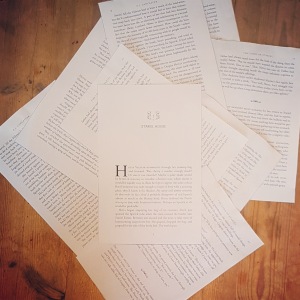
You can’t truly judge your typesetting until you see a physical proof copy, but printing out pages and cutting them to the correct page size is a useful proxy. Hence my living room has been looking like a bookish murder scene recently, full of disembodied pages:
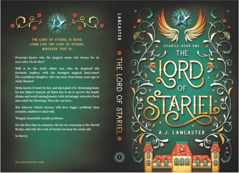
Once you’ve typeset your book, you then know how many pages it will be – which means you can work out the spine width! And from the spine width comes the BEAUTIFUL FULL COVER SPREAD thanks to my designer:
The last thing to decide on for a print book is the cover finish. As an indie publisher, I have two choices: matte or gloss finish (other cool combo options like metallic foiling and spot gloss etc aren’t available with the print-on-demand (POD) providers I’m using. I’ll do a separate blog about that, but basically POD means someone can order 1 copy of my book from a retailer and behind the scenes the printer will print and ship 1 copy directly to the customer.)
It’s quite hard to show the difference in a photograph, but gloss finish is, er, glossy, and makes colours seem richer. Matte is, er, not glossy, and it feels smoother in the hand but can ‘flatten’ darker colours.

Next step: Checking the proof copies! (It would be impossible to overstate how overwhelmingly excited I am to be able to hold ACTUAL PHYSICAL COPIES OF MY BOOK.)

I’m so happy to learn about a paper book version! I’ve nearly finished the ebook (alas…) and absolutely want to order this magnificent book!
Just a perfect read for me 3>
LikeLiked by 1 person
Thank you! I’m thrilled that you’re enjoying it so much =)
LikeLiked by 1 person
I’ll wait the next one impatiently! 🙂
LikeLiked by 1 person